The restaurant’s logo is what customers may or may not remember and is a vital part of restaurant branding.
Placed on business cards, booklets, banners, dishes, clothes or a site, it is capable of the first seconds of demonstration to declare your institution as a worthy place of attention. Or vice versa – to scare off potential customers, if it turns out to be of poor quality or just will not fit your restaurant.
Below we will give answers to key questions that may arise when working out the concept of the future logo of your restaurant.
Outline
- 1. Restaurant logos – what should they be like?
- 2. How to create a logo
- 4. Which color to choose for the restaurant logo?
- Get Bakery Website Design
- Get Restaurant Website
- Let Us Build an Industry Leading Media for You
- 5. Which font to choose
- 6. Can I experiment with the arrangement of the elements?
- 7. Additional recommendations
- To sum it up on restaurant logos
1. Restaurant logos – what should they be like?
The most popular and recognizable in this area are the motifs of the national cuisine (Italian, Chinese, French, Japanese, etc.), which is the profile for a particular institution. Obviously, in such cases, seafood, sushi or rolls, pizza are most often depicted on the logo.
In addition, it should not be forgotten that the logo should inform the client about certain qualities of the restaurant, mainly its format, style and direction. You need to decide what your logo should say, and then move on to the implementation of your idea through the correct selection of icons, fonts and colors.
2. How to create a logo
Depending on whether you decide to draw the logo yourself or leave it to someone else, there are different ways to put your idea into practice. It all depends on how much time and money you are willing to spend.
If the budget allows, you can order a logo from the designer, design studio or conduct an auction-tender. If you have time, you can create a logo for your restaurant yourself: manually or in a special editor.
However, the use of an online editor is the best solution when you want to save both time and money. So the further process of logo creation we will consider from this position.
3. Which icon to choose
![]()
As mentioned above, common elements of the logos are different products or well-recognized dishes. There are also obvious associations with the restaurant that cause certain items, such as
- Cutlery (spoon, fork, knife, glass, plate);
- Cook’s hood or apron;
- dishes (pan, spatula, ladle);
- oven, stove, etc.
Another thing is that the use of such popular elements can lead to the creation of a logo, which will be very similar to the already existing version. Therefore, before the final approval of the icons, review the logo of your direct competitors to avoid duplication.
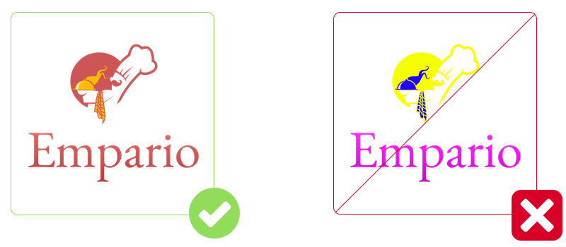
4. Which color to choose for the restaurant logo?
It is very important to choose a suitable logo color because of its visibility and compliance with its purpose depend on it. Each color causes the association and it is necessary to consider.
For the food industry as a whole, including the restaurant, it is worth choosing colors that are not too bright. In this case, the natural colors of food products look best: muted red, various shades of yellow and brown, as well as classic black.
You can also find a lot of tips when analyzing competitors’ logos. This will help you to understand in which direction to move in.
Also, if you plan to use more than one color or shade, it is important to choose a harmonious combination of colors or shades.
GRIN tech recommends the following colors:
- Muted red,
- shades of yellow and brown,
- black.
5. Which font to choose
If your logo has an inscription on it, you’ll have to choose the font. A detailed discussion of the selection criteria can be read in a separate article, and here we will briefly consider only the most important of them. So, the font you choose should be:
Readable. The inscription should remain legible and readable regardless of the size of the logo.
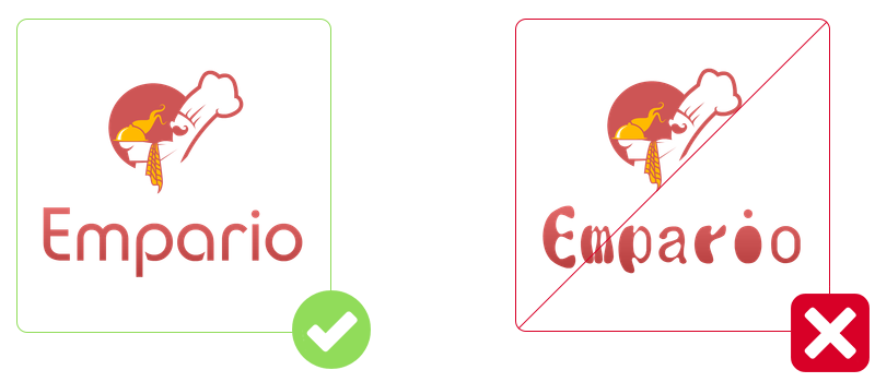 Harmonizing with the icon. Remember that near to a massive icon the massive font (After Disaster, Europe, Garamond, and others) will look well.
![]()
Without small details. Numerous scrolls-sections and whimsical handwritten fonts – not for logos, otherwise in small size the inscription will cease to be readable. The best variant is easy-to-read direct fonts like Micra, MagistralC, etc.
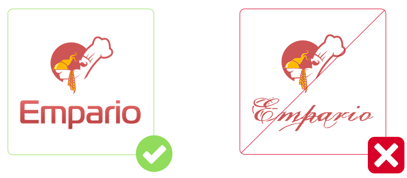
GRIN tech recommends following fonts for restaurant logos:
- Oranienbaum,
- Croissant One,
- Andantino script,
- Dita Sweet,
- Comfortaa,
- Garamond.
6. Can I experiment with the arrangement of the elements?
Not only is it possible, but it is also necessary. You can focus on the icon or inscription by increasing the element and leaving enough space between the parts of the composition.

7. Additional recommendations
Finally, we suggest that you read additional recommendations, which are sure to be useful if you want to create an effective restaurant logo. So:
- Don’t overload the logo, icons, and short inscriptions. In some cases, logos are effective if they are limited to one thing – either an icon or an inscription. By placing several images on the logo and accompanying them with a large amount of text information, you risk making the logo extremely illegible.
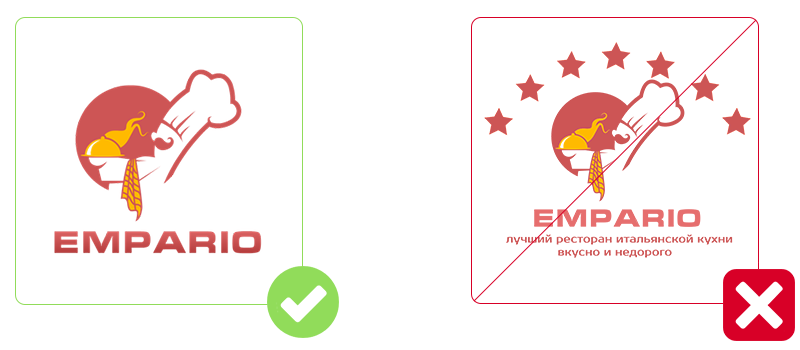
- Avoid using multiple fonts. It is best to use one option, two at most, in harmony with each other. If there are more fonts, the logo may become untidy.
- Do not turn the logo into a rainbow. If you’re short of one or two colors, you can expand your palette to up to 4 colors and use their additional shades, but no more.

- Leave space around the logo. Very close the arrangement of the elements of the composition relative to each other and the borders of the logo makes it difficult to perceive. Leaving a little “air” will not only make it easier to recognize the logo but will also allow you to place it on any product without any inconvenience.
- Avoid copying. Focus on your competitors, but without copying their work. Analyze which solutions have been successful in other restaurant logos and why, and then fine-tune the idea and make it even better!
- Consider creating a logo in the vector. This way you will save time and effort, saving yourself from having to remake the logo every time you need to place it on a very small or large surface.
To sum it up on restaurant logos
There are multiple ways to do a logotype for your restaurant nowadays. Be it an online store of pre-made logotypes, some sort of logotype builder or a design agency (as GRIN tech 🙂 just keep in mind recommendations above and your logo will look sharp and will contribute to your restaurant brand identity a big time.