It is time to redesign a website if:
- Did your company vision \ mission \ configuration changed?
- Does the design look outdated?
- Are my conversions/sales decreasing?
- Have I received complaints about user experience or design-related issues?
Let’s dig into workflow (preparation & execution), FAQs, examples and common pitfalls.
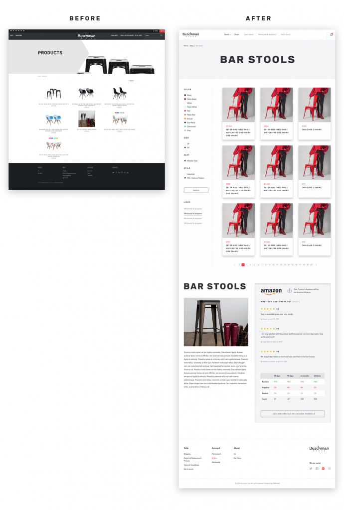
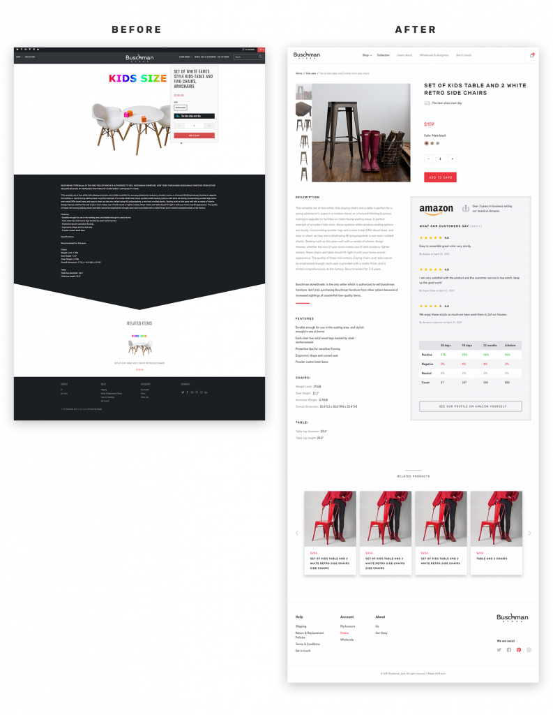
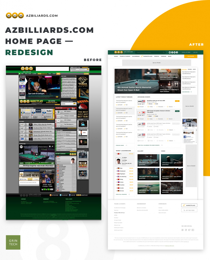
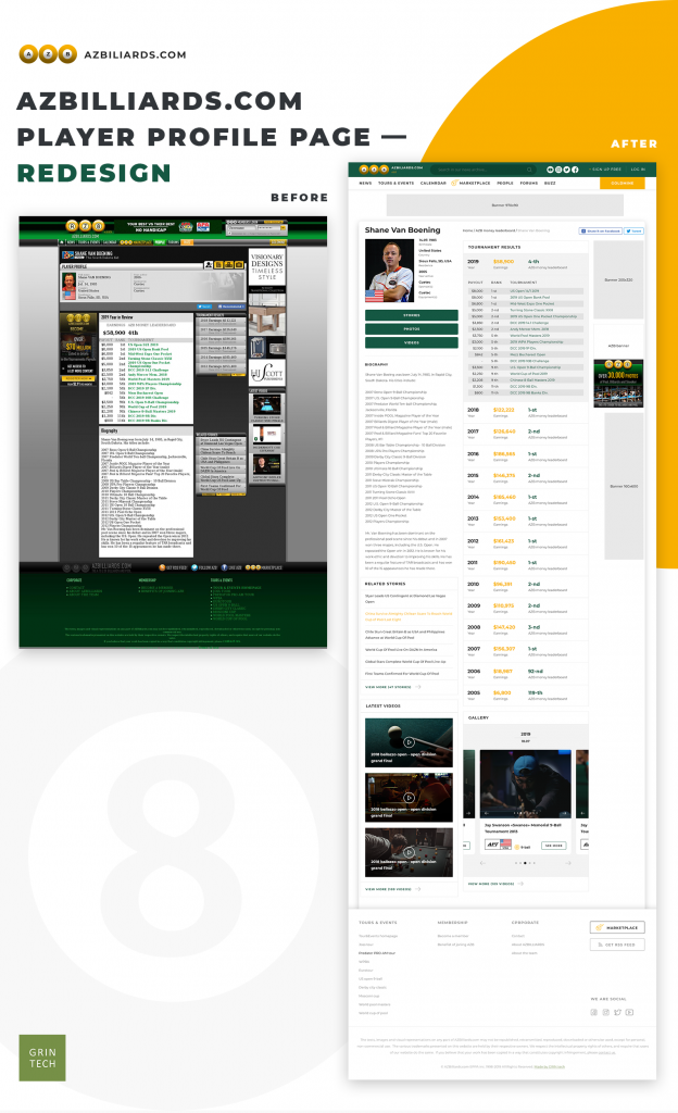
p.s. we included GRIN tech’s two recent redesign projects below – check out BEFORE\AFTER sneak peeks.
Outline
- Website redesign process (workflow)
- Things to consider
- Pure cosmetics redesign
- Growth-driven website redesign
- Backend and backstage redesign
- Frequently and Rarely Asked Questions
- Website Redesign Tips and Best Practices
- Rad Website Redesign Examples (Before VS After)
- Not So Good Website Redesign Examples (Before VS After)
- Is e-commerce redesign different?
- GRIN tech’s approach to website redesign
- To sum it up on website redesign
Website redesign process (workflow)
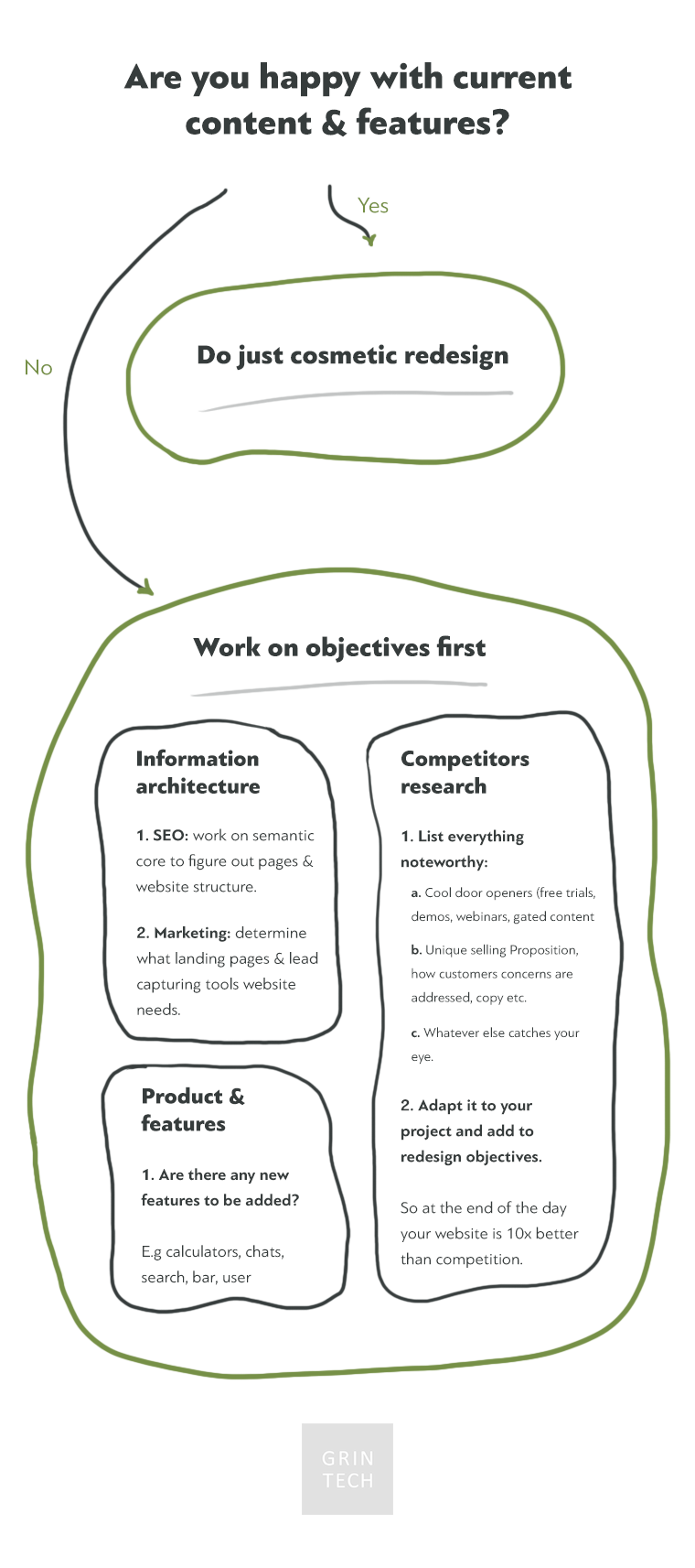
Objectives checklist
One redesign website for a reason (mostly, lol) and I find it’s extremely helpful to make a checklist with objectives. At the end of the day, after fancy mood boards, you need to ensure you nailed your goals.
Here are a few directions to look at:
- Current problems
- Wanna-haves, e.g.
- New sections
- Expanded \ unique pages
- New features
What else must contribute to the objectives checklist?
Competitor research
Personally, I do this part like this:
- List direct and direct competitors (on top of my head, because they are usually breathtaking AND based on Googling mainstream terms)
- Add the following into a spreadsheet for every competitor listed:
- Cool door openers (free trials, demos, webinars, gated content, etc)
- USP (Unique Selling Proposition) and supporting statements
- Pricing
- Whatever else catches your eyes
Marketing (and stakeholders) interests alignment
Aligning stakeholders’ interests is a key to success in every project, not just website redesign, but that what I mean here:
- Execs usually want high-level things like good looks, conversions, etc
- Marketing people need
- Landing pages
- SEO optimization (see Information Architecture section below)
- Certain CTAs, features & door openers to convert visitors
- 3rd party tools integrations (banners, chats, email capturing, gated assets and whatnot)
UX audit
UX audit. Self-service guide & few rad resources to make things rolling
Execution
Information architecture (SEO, keywords research and all that)
Here you go, 5300 words on that topic and common SEO pitfalls: How to tackle SEO before you ship website to production or even build it
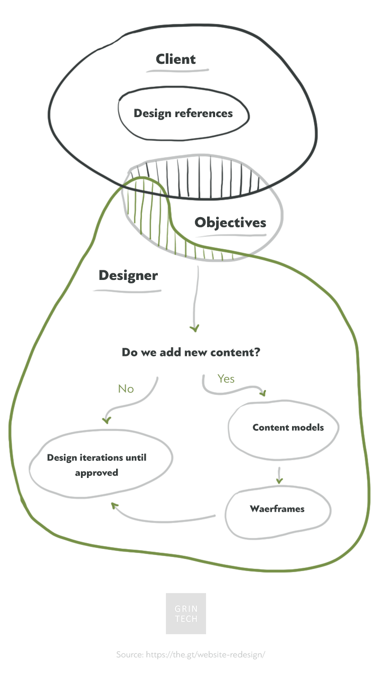
Design references
When building a website from scratch, if you don’t have a strong, informed opinion (and most clients don’t) on how things should look and feel like the only information a good designer will need is these:
- Colors
- 3-5 examples of websites that give you chills – either already live, or some concepts from Dribbble, Awwwards, etc.
Since we speak about a website redesign, unless you want to completely revamp everything, just find design references.
BTW, here are few thoughts of mine on how entrepreneurs can benefit from Dribbble.
Wireframes
- Do content models
- Do some hand-drawn wireframes first (or use a tool like Balsamiq Mockups or Figma)
- Ask the designer to make the first iteration on top of that,
- and continue shaping it in iterations
BTW, common logic suggests starting working on the home page first and nailing it to the end.
Content planning & execution
How is this different from information architecture?
It’s one thing to have a website structure outline and whole different endeavor to actually build all those photos, copy and whatnot.
As a content marketing agency, we work with multiple clients and content approval is the most common bottleneck; not the planning, execution & promotion (duh).
Development & testing
Right, so many things you should keep in mind, do, research and whatnot, but at some point you’d have to actually do the thing.
Don’t fuck it up.
Or just hire us 🙂
PRO TIP: Before shipping into production
We all have opinions and it’s fine, but data-backed knowledge is better. I usually log-in current stats (traffic, time on site, bounce rate, etc) to benchmark it later to the redesign results.
Keep in mind, that there should be enough data to have statistically significant benchmarks before and after you roll out a new design.
Data alone, of course, can get you that far. Conversions are the true reason for website existence (ideally) and the industry average is like 3% (hello b2b guys 🙂
Consider this life-hack: Micro conversions – scale analytics user coverage from 1% to 100%
Ongoing Improvement
It is a common thing to say in such articles “do A\B testing, ongoing improvement” and blah blah blah.
Truth is, most of the websites don’t have enough traffic to run statistically significant tests, especially on individual pages. As Nat E. from Growthmachine said somewhere:
I don’t usually optimise anything conversion wise untill there are 100 000 people coming from Google every month
Duh.
There is one thing that even small businesses and low-traffic websites should optimize though:
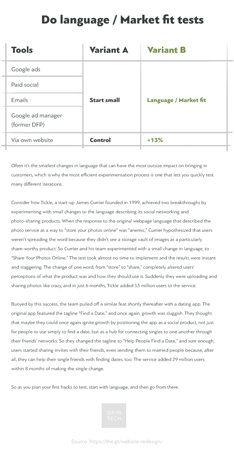
Language\market fit in headings, titles, USPs and other short-form copy.
Here are a few ways to do so:
- Google Ads
- Emails (either through own lists or as an advertisement. Note, I strongly advise against purchasing list, but there is an option to pay for list building tailored to your needs if you are in b2b sector)
- Google Ad Manager to run AB tests on your own banners and compare CTRs.
Things to consider
Whatever path makes you realize the need to redesign your website, the ultimate goal should be to increase sales (ROI, LTV, Average Order Value (AOV) and other fancy metrics). There are also supportive metrics to improve: organic traffic volume, time on site, avg. pageviews\session etc. All these things have to be measured in hard numbers. Proper setup of Google Analytics would do.
Tip: check metrics above within segments as well: across devices (desktop, mobile and tablet at the very least), traffic sources, google analytics build-in advanced segments, home invented and implemented via content groupings user brackets etc.
In an ideal state of being online stores are continuously updated to hit new milestones and metrics, respond to ‘ever-changing market environment’ and all that. This constant evolution should include a mix of marketing, design and development efforts. Consider the follow following example in nutshell thou:
A strong team of developer and marketer runs small niche store. Design was made by freelancer 2 years ago. Since that store got few dozens new landing pages, email marketing, handcrafted banners to run promotions etc. So the project is actually constantly evolving and making sales, just lack design expertise. If so, why force ‘let’s throw away your thing and do everything from scratch?’ on them?
So one doesn’t need a “redesign website” (hello there, “will redesign whatever you want for that much money”). I say one should consider options.
Pure cosmetics redesign
I do not like people selling redesign services as if you have some old and ugly website right now. It could be just better though 🙂
Sometimes it is good as it is, or you are tight on budget and not ready to spare a buck for the whole hipster-looking gang: UX and UI designer (two different guys, huh?), project manager, marketing guy, analytics guy, front end developer, and backend engineer. The designer and coder will do.
Deliverables
- It will become responsive and therefore device agnostic. I see this one as most often a reason to redesign the website
- Design system specification might be a hype term these days, but ultimately it boils down to unifying all those twenty-different-variations of elements and compiling a few PSDs for future generations of freelancers to come
- Retina-friendly, pixel perfect, Dribbble-worthy PSDs ready to be coded
- Hell, it will just look good
Growth-driven website redesign
Catch with this option might be an implementation of Dribbble-style e-commerce design: eye-catchy, bust mostly worthless from business and marketing perspective. Therefore, such restructuring has much less to do with the design itself. It is more about re-thinking user experience, marketing, and SEO strategies. Good starting points are:
- User behavior data, the most common source is Google Analytics
- Changes needed to improve SEO performance
- New features and best practices, also those of your competitors
Note: when moving things around, be careful with changing links. They either should stay intact or should have 301 redirects to new pages. This way you will see no adverse change in organic traffic.
Deliverable: a shiny brand new website builds with proper usage of previous assets.
Backend and backstage redesign
By backstage, I mean an internal business kitchen. How to order fulfillment handled means of communication with clients, accounting, etc. There is always room for some improvements and automation, but it should always be questioned in terms of ROI. No need to optimize things faster than business grows.
Tiny case: first 3 month TENNIS.DELIVERY’s orders were injected in Google Spreadsheet where manager was handling them manually. On 4th month we build a super functional (but quite ugly) CRM with various SMS and email notifications on order status change, calculated some bold statistics etc. When we added second store to the DELIVERY family (devoted to running), we simply copied files. When we started third store development of the same brand we made a micro service in order to have one source code for all three shops.
Backend redesign is not that famous thing. Mostly because it deals with technical debt or system scaling and therefore handled by the dev team in charge be it in-house or outsourced — silent introvert heroes.
Reasons for such endeavor include:
- More products than the initial solution implied
- Ultimately, even marketing automation (e.g., emails) might be a part of a full-stack redesign since it relies heavily on technical infrastructure
- Reducing technical debt, i.e., reducing costs to support and expand current IT infrastructure
- Need for better Content Management System (CMS). Content is king. For example, having more than 18 reviews on the product page can boost sales by 84% they say
- Speed and performance issues
Frequently and Rarely Asked Questions
How much does a website redesign cost?
It depends on how big the current website is and what tech stack is used and can be used for a redesign.
GRIN tech did some for $400 for a quick revamp including coding and some were priced few grand for the design alone.
How long does it take to redesign a website?
1 day to infinity if not all stakeholders are on board 🙂
Website Redesign Tips and Best Practices
- Add strong visual features and elements
- Personalize your website based on your brand
- Build a blog if you still haven’t
- Add new dedicated landing pages
- Optimize the entire website for SEO
- Make sure all pages are mobile-first
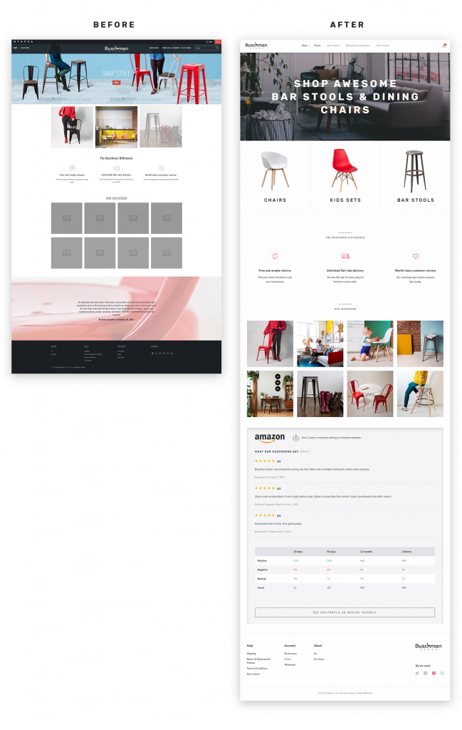
Rad Website Redesign Examples (Before VS After)
Buschmanstore.com
Here is a redesign we rolled out recently:
Home page
Category page
Product card
azbilliards.com
Still working on that on, tsss.
Home page
Player profile
Not So Good Website Redesign Examples (Before VS After)
Woah, sorry, I am still working on this part.
Is e-commerce redesign different?
Remember when this one service you loved and used often shipped redesign overnight? I believe it is okej to redesign some visit-card like corporate site overnight, but for e-commerce sites with a build-up audience, it might and will cause negative feedback. One way to address the issue is to ship redesign steadily over time.
GRIN tech’s approach to website redesign
Woah, sorry, I am still working on this part.
To sum it up on website redesign
There are tiny local businesses where you just do the thing without overcomplicating it. It takes a few hundred bucks and a couple of weeks.
There are mature businesses operating entirely on the Internet with tens of thousands of pages, huge organic traffic to take care of, good historical data, etc. that requires incremental improvements that are often called Growth Hacking rather than redesign.
And infinite spectrum in between.
Get in touch and let’s just talk through what you have in mind.
